How to Apply to DTS
Summary
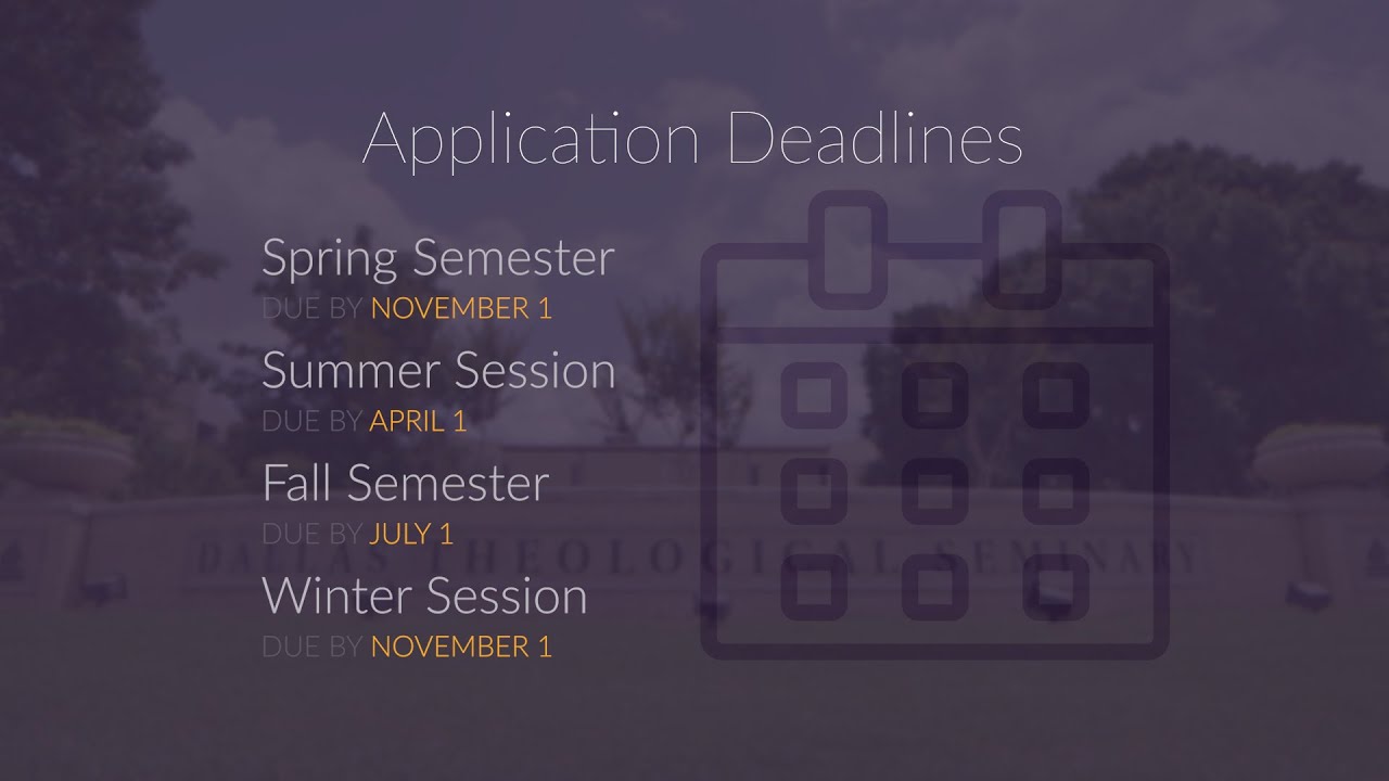
While working with Dallas Theological Media Pro team, I was given a simple video covering the application process. (The project had been sitting on the shelf, already started by a previous team member, and just needed to be done.) The content, which was very informative, afforded some broll. Most of the video, however, would be screen recordings of a mock person named “Gala Greens” clicking through the online application.
If you’re imagining a very dull and painful video to watch, you would be experiencing my own anticipation before beginning this project. Even with broll and upbeat music, the potential for a painful three minutes was high. Thankfully, my experience as a graphic designer came into play. Where film faced its limits, graphic design brought life.
Three simple decisions made a huge impact. One, manage viewers’ focus. Two, add visual interest. Three, increase readability. I hope you enjoy these next few minutes.
Three Simple Decisions Changed Everything


Manage Viewers’ Focus
We took screen recordings of the online application. These recordings often contained a lot of visual noise.
The voice-over refered to a specific portion of the screen, but the entire screen was shown.
So, when appropriate, to manage viewers’ focus, I added a soft blur to everything except the content being referenced. In one situation, I even highlighted the words.
Add Visual Interest


Increase Readability
Final Video

